・建設地 群馬県
・敷地面積 390.10㎡(118.00坪)
・建築面積 147.99㎡( 44.76坪)
・延床面積 158.92㎡( 48.07坪)
・住宅床面積(駐車場等を除く) 99.03㎡( 29.95坪)
・構造 鉄筋コンクリート造
【住宅】 Fu-1 house
●色を消す
建物の色や素材感を消去していく。
残ったものは白い色と金属の素材感。
消すことにより現れてくるものがあります。
たとえば、影の存在。 影の濃淡で天気を
知り、季節の移ろいを感じる。
【もう少し】
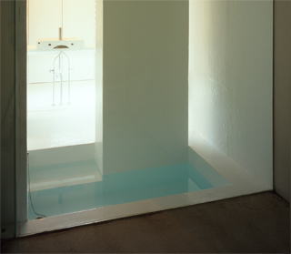
浴槽も消去
いろいろなものを消去していくと浴槽の存在も気になります。 建物本体と同様にコンクリートを打った後白く塗装して存在感を消しました。さらに床の延長が浴槽になるようなイメージで階段をつけました。ここにもほかの場所同様床暖房を施し、 お湯が冷めにくいように計画してあります。


.jpg)

-How did you deal with the place, the site and the environs?
The house is located in the country side and vegetable fields and mountains can be seen just a couple minutes walk away although the surrounding area is residential. When I started this project, I found a rich and unique aspect of the climate of this region and I wanted to express this in the design. In the winter the cold wind blows down onto the city and in the summer the sudden rain falls with thunder.
The methodology of architecture is becoming more and more complicated day by day. However, I sometimes question to myself “Does a house really need such a complicated approach?”When you seriously face the simple thought of designing a house which fits the primitive demands such as avoiding rain, cold, wind and shielding from strong sunlight, my answer is “No” Simply from one component “shelter” residential architecture can be constructed. In the tradition of Japanese houses, the eaves play an important role. In Japan, they are designed to protect from heavy rain at the end of spring and from harsh sun in summer. You also can find poems talking about the nostalgic scenes of people staying under the eaves watching rain drops when the sudden rain hits.
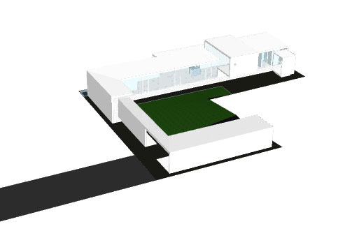
The entire site of building is wrapped with the roof, wall and floor, and only the center court is open to create an “eave” effect.It has a reinforced concrete structure and, as I didn’t want a wall on the side of the yard, there are supporting iron columns which also work as window frames.All the elements are directly painted onto concrete with water-&-heat-proofing material. Only the floor does not have the heat-proofing function because of the floor heating system within it.
-What was your idea to this? Your concept? The materiality?
It is not only this project, I always try to keep my work simple. It is because when you delete unnecessary elements, what you want to show will become clearer. I love movies and they have diverse methods of expressions, for example the scenery, story line, sound effects, etc. However my favorite movies don’t have many of these techniques. My favorite movies often don’t have background music or detailed explanations, or they were shot in black and white. My favorite movie director, Yasujiro Ozu told the actors “Don’t say the lines with emotions. The emotions are spoken by the scenario.” When you avoid all the unnecessary decorations, in other words, when you try to show something in the simpler form, you will see something new and bright.
Although architecture is consisted of a number of different geometric, material, and color factors, I believe in the beauty of simplicity. Even the shade lying on the simple shapes has its own aesthetics. At a certain level, I always wish to address the beauties of the surrounding elements. In addition, another important concern for me is how to situate its residents in the project. I appreciate the beauty of the human body. To me architecture is not a show of the piece; it is an opportunity in which people interact with the combination of natural environment and the users.
In this project, the building sits along the perimeter of the property line. In the contemporary situations, it reminds me of soccer fields that are surrounded with the terraces. The clients play tennis so I explained to them to that it would be like the center court at Wimbledon. The grass center yard is not the main character in this project. It doesn’t have a symbol tree or benches. The component, which is supposed to be the seats for the spectators, is dedicated for the main volume of the house, the garage, and the walkway, all of which are designed with the same formal language. Since there is no fixed hierarchy between all elements, for example the garage can be made in to a room with a sheet of glass enclosing the aperture, I am always trying to leave possibilities for the future use.
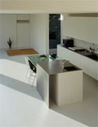
The interior also doesn’t have too much specified purpose. In general, a house has a living room for relaxing, a kitchen for cooking, and a bedroom for sleeping, meaning the architect limits the usage. But actual living is a lot more flexible. Not everyone has meals in the dining room all the time. This example is also from movies, one main character from a French movie was living in his bathtub. He eats and reads in the bathtub. Like this example, when the occupants do certain activities, they unconsciously choose the most comfortable place for it in the house, like the stairs are the device to go up and down but if you wish you can sit on and watch TV and it becomes your living room.In this project, I consciously played with this concept; layering the different possibilities for the area. It is aiming for the flexible comfort in all corners of the house.The bathroom can be used as a reading room as well. Generally speaking, people wash their faces and brush their teeth in the room and don’t use it at other times. On the other hand, the clients don’t care how it’s used at the other times as long as they can brush their teeth and wash their faces when they want to. In the room, there is a cantilever table which has a double function; one is as a washbasin, and the other is as a working desk with a power outlet for a computer. Sitting at the table, a bathroom, that is meant to not just look like a bathtub, can be seen through a glass wall and past the bathroom is a smaller court yard. Of course there is a fridge for beer behind the table for longer relaxation.Another example is the bedroom without a bed. At night they put the futon on the floor so that the room can become a home theater in the daytime.When I think of a kitchen, I try to depart from the kitchenish-looking kitchen. In this case, it is designed to be a kitchen and a lantern to illuminate the other space in the house. These changes between daytime and nighttime are something that I always keep in my mind.
Those multi-function/ flexibilities can be often found in Japanese architecture. Back in the old days it was common for us to eat, relax, and sleep in a single tatami-matted room. The memory is perhaps strongly influencing my design attitude.
-How did the room sizes/ allocations and floor plans come off?
As I said earlier, the garage, enclosed volume and walkway between them don’t have any hierarchy, neither does each room. Under this situation, I think the circulation is important. I paid careful attention to the flow such as you drive back home and go to the entrance via the walkway. The final plan has two paths to the entrance; one is walk along the walkway under the eaves, and the other is walk along the wall behind the walkway. this is also good example of flexibility.
Interior measurement is based on the 3m-width so the inhabitants can focus on the length of the house rather than its width and so that also minimum number people can freely occupy it. From the entrance of each room to the bathroom at the end, you can see the center yard at any moment (on your right). For the smooth transition from one room to another, there are no walls in the direction to prevent the flow. All the doors are sliding doors or foldable doors except the bathroom-the bathroom has glass door.
The sequence of eye movement to the exterior is as important as to the interior. There are several tricks so that some points outside catch your eye. Standing by the kitchen, on the left you can see the neighbor’s garden and on the other side you can see the stairs to the rooftop and the small rock yard under the stairs. This can also be a pond which creates a cooler view in the summer. Also, there are a couple more of those spots outside. When you enter the house, you can see the trees of the neighbors. This is called shakkei (borrowing scenery) in Japanese.
This building tries not to deny the surrounding houses even though they are not well-designed. Instead, coexisting with those and let them be is another keyword for this project
- Construction area: Japan.
- Building use: Single-family house
- Site area: 390.10 ㎡
- Building area: 147.99 ㎡
- Gross floor area: 158.92 ㎡
- Construction: Reinforced concrete structure
- Year of the completion: 2006
- Family composition: Couple and one child